How Charlotte Culot Reimagines Rugs As Abstract Masterpieces
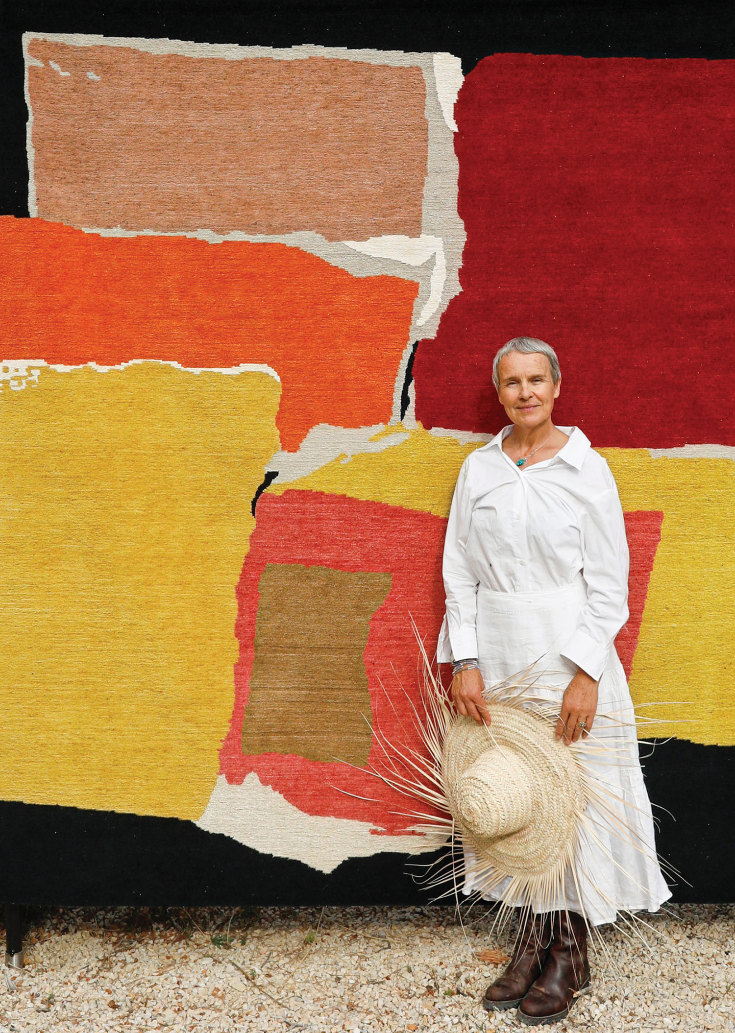
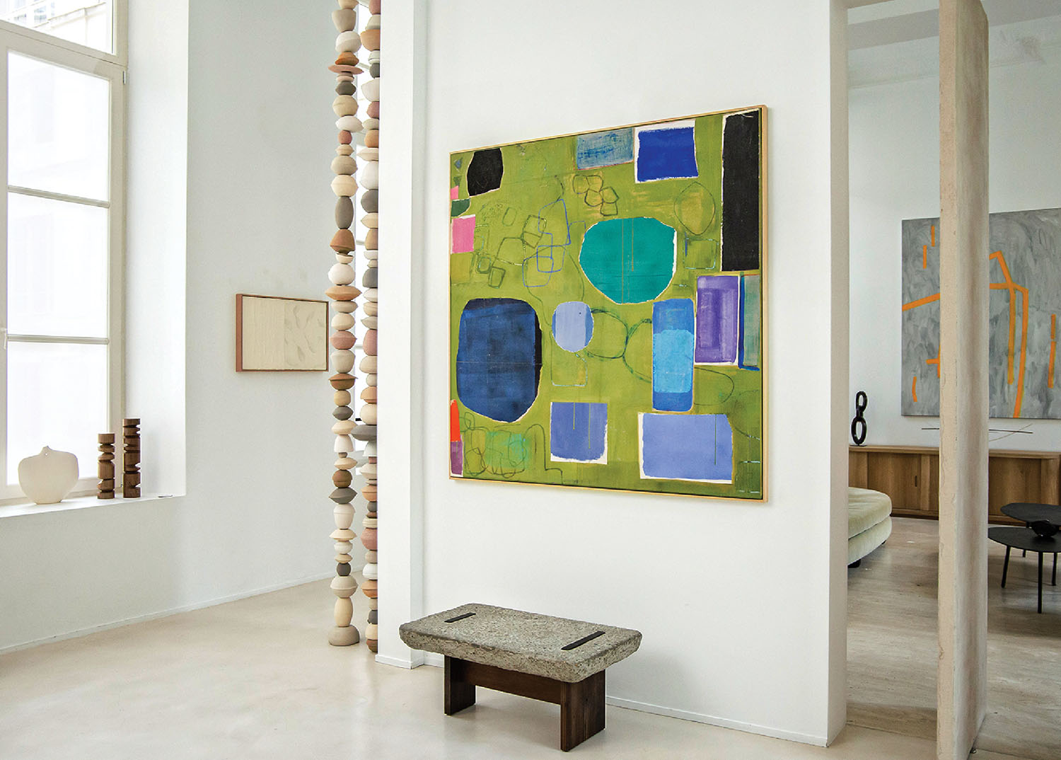
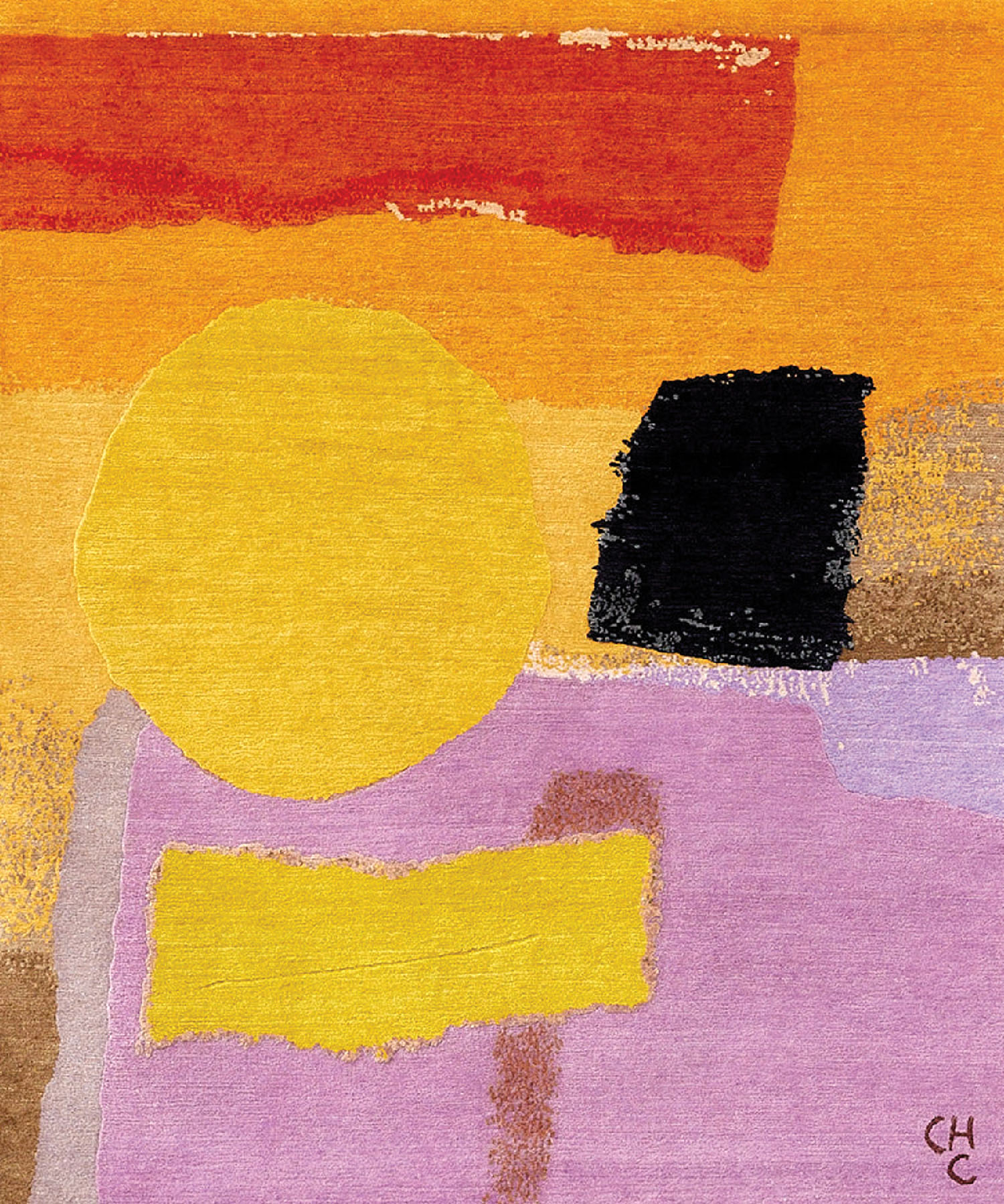
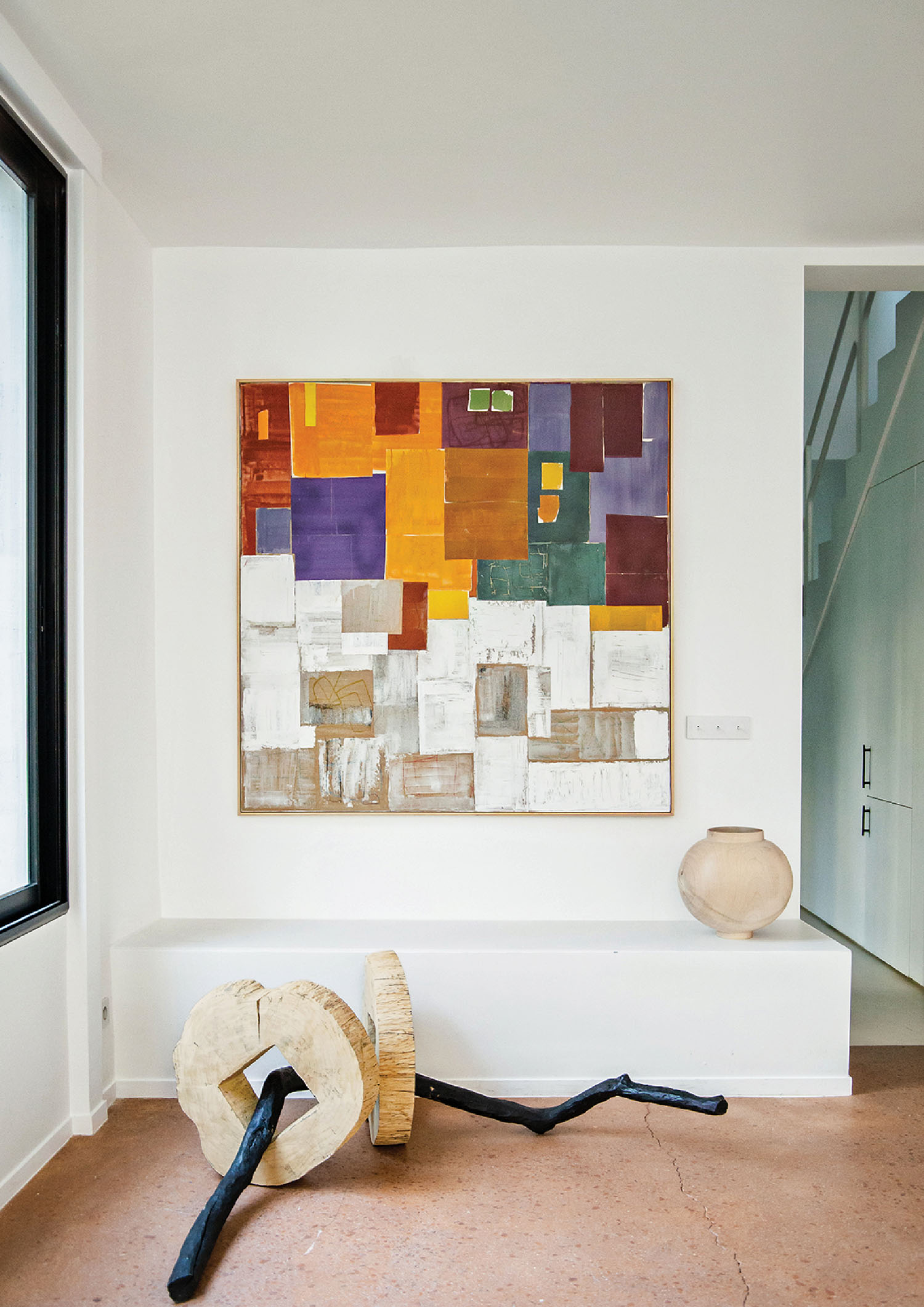
It took Henri Matisse a lifetime to achieve the simplicity of the paper cutouts he made in his later years—works of great sophistication that nevertheless appear effortless, as if art had become joyfully easy for him. A similar sense of happy mastery can be found in the brilliantly colorful, strikingly graphic rug collection that Belgian-born French painter Charlotte Culot has created for Maison Rhizomes, an atelier she cofounded with Hannah Vagedes in 2022. In fact, Culot began her career painting still lifes inspired by the vibrant palette, flat perspective, and compositional framing that Matisse and the Nabi movement favored. She showed those early works in her first U.S. exhibition 20 years ago. “It took me about 15 years to evolve from the semiabstraction of the still lifes to the real abstraction I practice today,” she notes, a move toward pure color and form that’s epitomized by the rugs, which comprise most of “Weaving Colors,” a show of her current work now at the Amelie Maison d’Art gallery in New York.
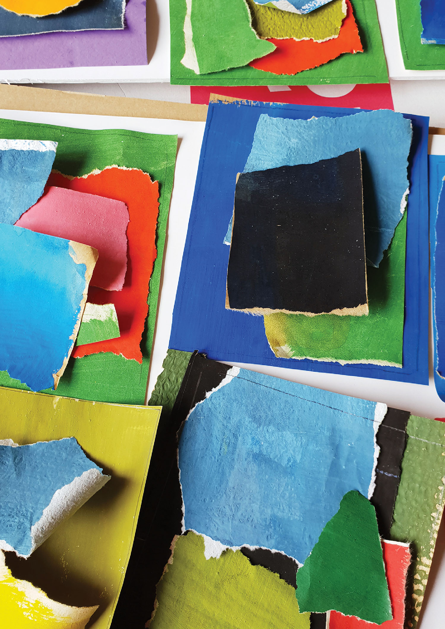
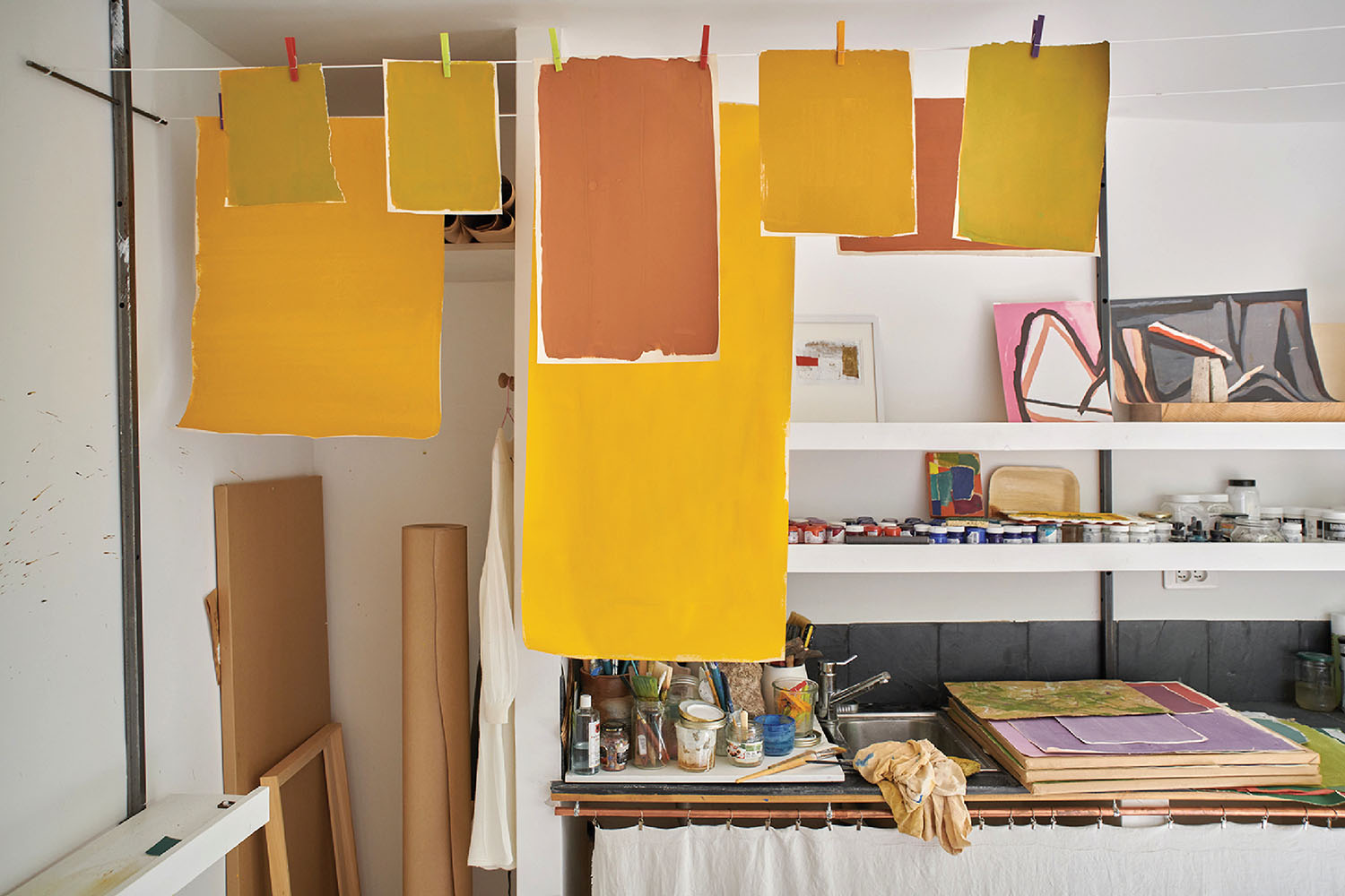
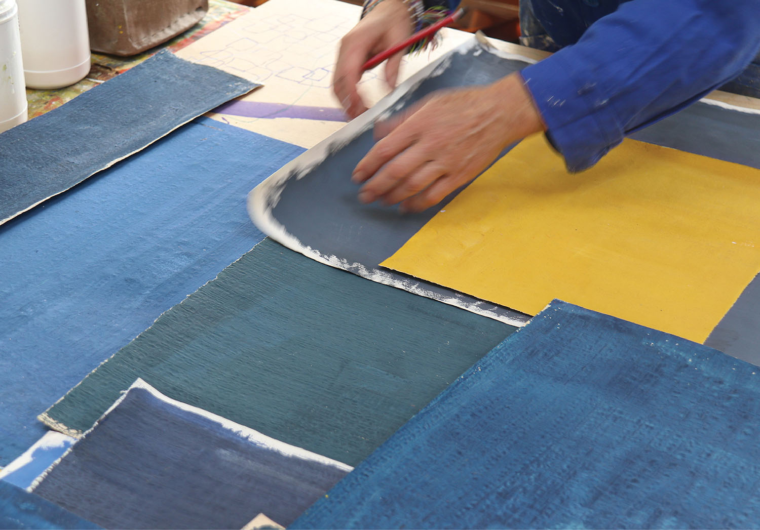
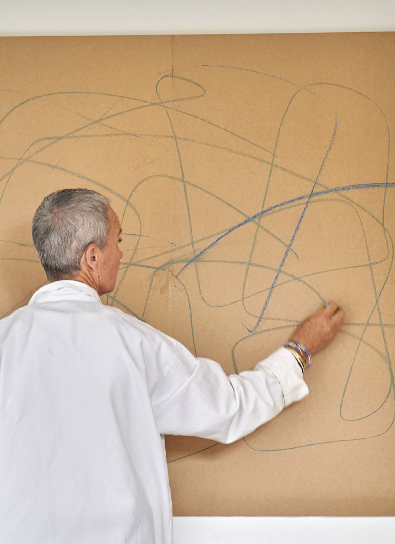
The daughter of potter and sculptor Pierre Culot and children’s book illustrator Micheline Wynants, Culot grew up in an 18th-century farmhouse in the Brabant countryside, immersed in art and nature. Confident that artmaking was in her DNA, she eschewed formal training, opting instead to study archaeology and art history at university, where she wrote a thesis on the traditional mud architecture of West Africa. Since childhood, she has worked with gouache, a medium she loves for its matte finish and saturated pigments, which she always mixes herself. Adopting a collage technique, she applies the gouache to wallpaper that she tears into various shapes and pastes onto a kraft paper–primed canvas. Built in layers, her abstract images seem architectural in both form and content. Intriguingly, an architect inspired Culot’s move into rugs, as she explained when we talked to her recently.

Charlotte Culot’s Rugs Capture the Essence of Southern France


Interior Design: After years of collage painting, what led you to start designing rugs?
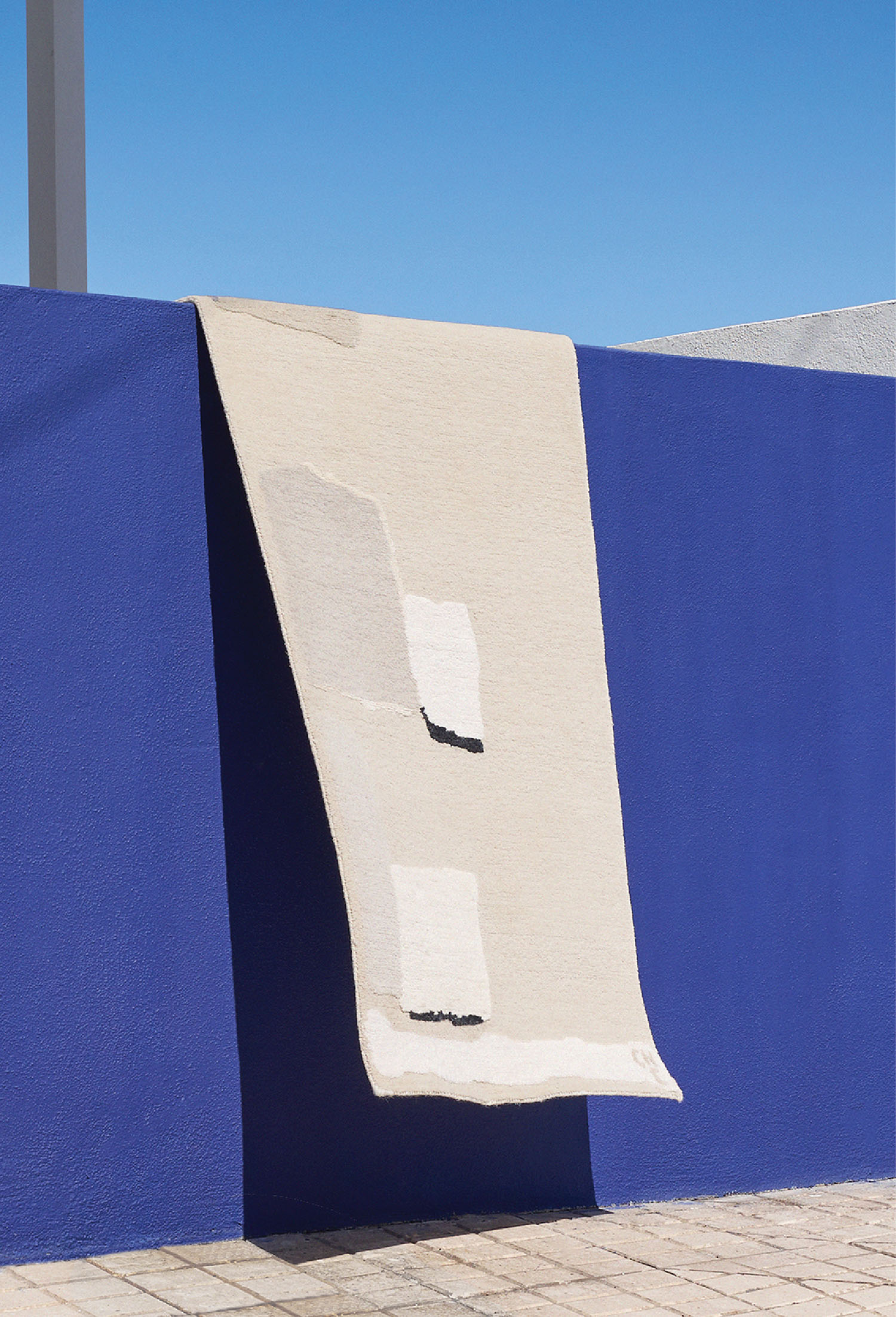
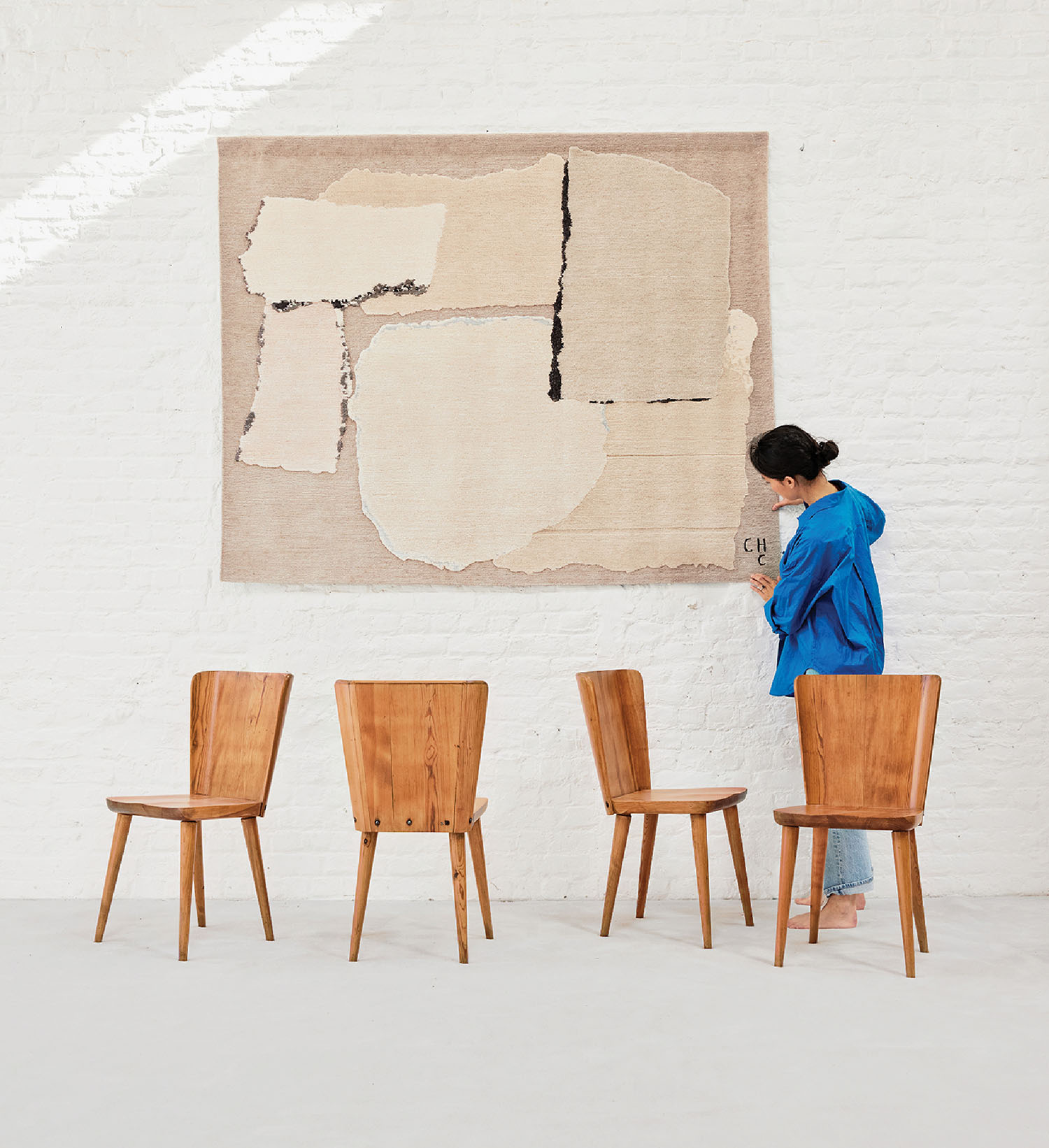
Charlotte Culot: Back in 2017, at a Tadao Ando–designed art pavilion near Aix-en-Provence, I saw a tapestry by Le Corbusier on a wall and thought, Wow! So, I started making tapestries. In 2022, my business partner Hannah Vagedes and I founded Maison Rhizomes in Berlin as a studio for hand-knotted art rugs. We collaborate with skillful workshops in Nepal and India, using Tibetan wool and Chinese silk that are hand-dyed on-site. Each rug is produced in a limited edition of 22.
ID: You call them ‘rugs,’ but wouldn’t it be more accurate to say you’re using a knotted-rug technique to achieve a tapestry effect?
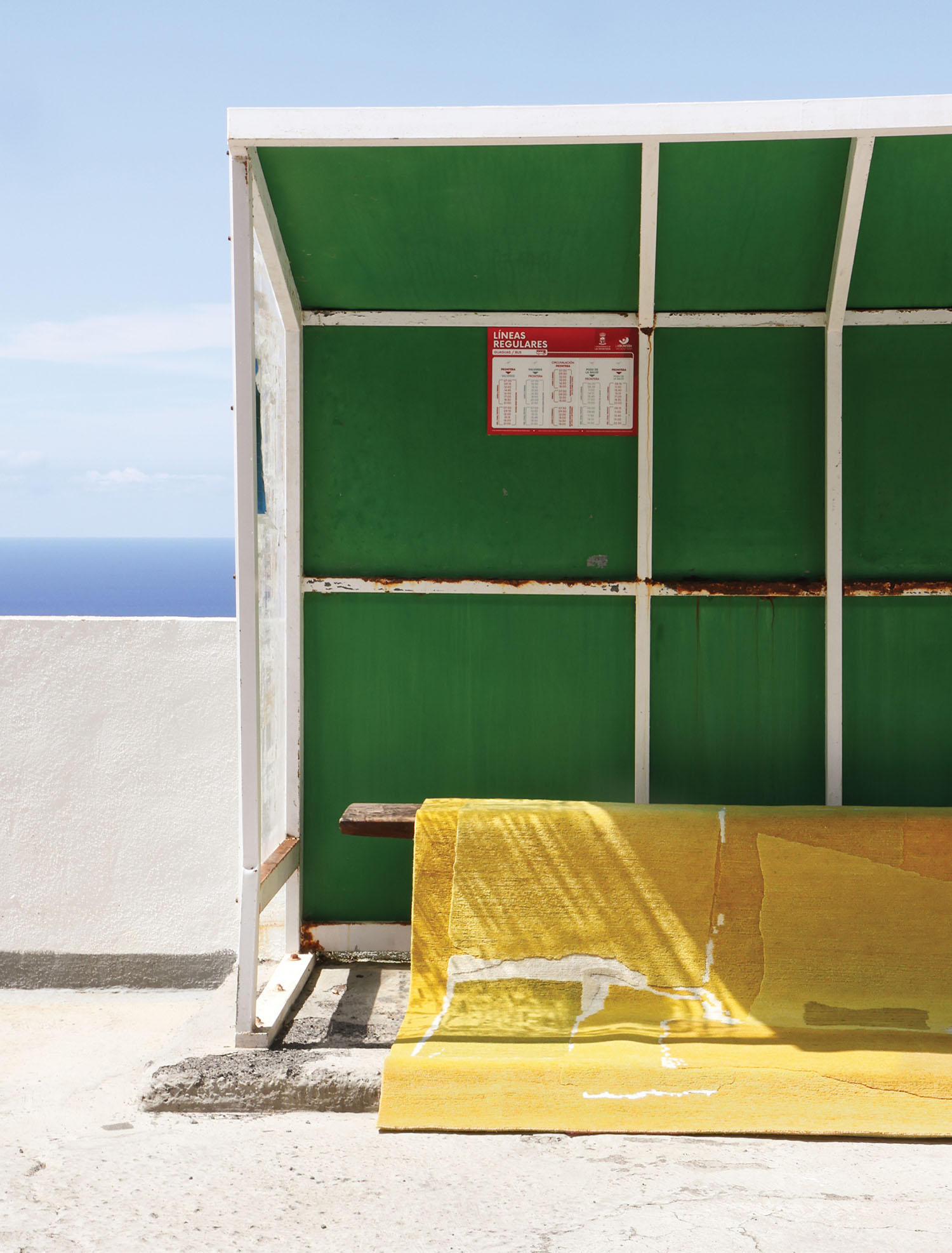
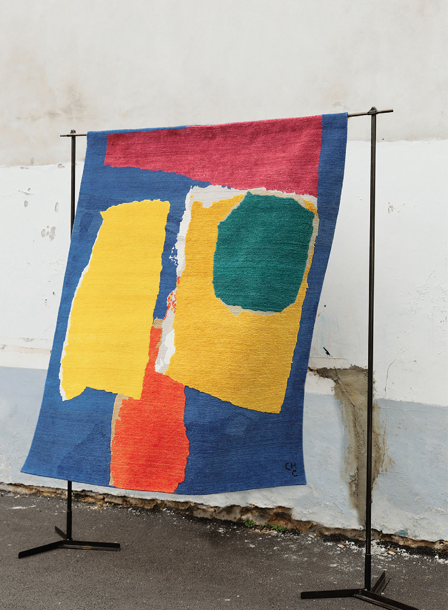
CC: Yes, that’s why I often refer to them as ‘art rugs’ or ‘tapestries.’ Early on, our customers decided to hang them on the wall like paintings rather than put them on the floor. They start as micro-size collages, about 11 by 13 inches. Sometimes one of these hits the eye as a fantastic rug pattern, one that works no matter which way you turn it. (As one of my favorite artists, Nicolas de Staël, noted, a good painting should work just as well hung upside down.) So that acts as our maquette, and we recreate the layered, textured collage effect with different heights of pile—you can touch them and feel the difference.


ID: Why the name Maison Rhizomes?
CC: A rhizome is a plant stem that grows horizontally underground, generating new shoots and roots. It’s a symbol that perfectly embodies our connection to nature. By adding ‘maison,’ we’re signaling our commitment to offering artists a nurturing space to translate their paintings into a new medium.
ID: It’s quite noticeable that the rugs are very painterly. Who are the artists you admire and how have they influenced you?
CC: When I started painting, I really liked Matisse, particularly the way he framed his compositions because I was also interested in photography. I’ve used gouache since I was a child, so I was mesmerized by his cutouts and the way the cutting makes the medium jazzy. Acrylics and oils don’t interest me nearly as much. Following Matisse, I began painting white wallpaper with gouache, tearing it into pieces—déchirer, as we say—enjoying the energy of the moment.


ID: That’s an interesting difference from Matisse, who used scissors.
CC: I like irregularity and accidents, a bit of craziness. I’m also drawn to American color field painters like Helen Frankenthaler, Mark Rothko, and Joan Mitchell, who’s probably my favorite. And then there are Russian-born French artists like de Staël, Sonia Delaunay, and Serge Poliakoff—I feel I really understand what they try to express.
ID: You split your time between Brittany and Provence. Many of the rugs seem to embody the sunny essence of Southern France, like the paintings of Pierre Bonnard.
CC: Bonnard is probably not as well-known as he should be, but if I had to choose one French painter, it would definitely be him—he’s really my chouchou. He allowed me to assemble colors that normally don’t work together, turquoise with pink with yellow with orange and so on. Color is really energy. If you scuba dive, you’re always surprised by what you meet. With colors, it’s the same: endless, infinite. Like Bonnard, you can spend a lifetime assembling them.


ID: You’re also a serious equestrian who keeps horses. How does that relate to your artwork?
CC: Nature is my soul, my base. I couldn’t do what I’m doing creatively if I wasn’t connected to nature. I spend a lot of time in my head, so I need to ground myself. My horses help me do that—it’s all part of the journey, I would say.




read more
DesignWire
Jeremiah Brent Talks Design and Queer Representation At Penn 1
Jeremiah Brent talks with Interior Design Editor in Chief Cindy Allen at Penn 1 in Manhattan, kicking off his third season as host of California Closets’ podcast.
DesignWire
Get Cozy With Benjamin Moore’s 2025 Color of the Year
Embrace the beauty of the Benjamin Moore 2025 Color of the Year Cinnamon Slate, which stuns with its inviting and soothing nature.

